✨
Snippets
CSS Snippet: Glassmorphism Card Effect
By Mohd Baquir
Qureshi
•
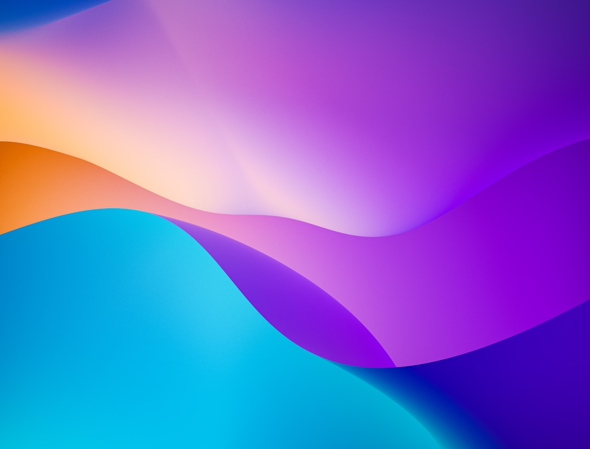
Glassmorphism relies on a translucent background combined with a background blur, giving the illusion of frosted glass hovering over content.
The Snippet
.glass-card {
  /* The core frosted effect */
  background: rgba(255, 255, 255, 0.25);
  backdrop-filter: blur(12px);
  -webkit-backdrop-filter: blur(12px); /* Safari support */

  /* Subtle border to define edges */
  border: 1px solid rgba(255, 255, 255, 0.18);

  /* Rounded corners and shadow for depth */
  border-radius: 16px;
  box-shadow: 0 8px 32px 0 rgba(31, 38, 135, 0.07);

  /* Layout specifics */
  padding: 2rem;
  color: #1e293b;
}

/* For dark mode glassmorphism */
.glass-card.dark {
  background: rgba(17, 25, 40, 0.75);
  border: 1px solid rgba(255, 255, 255, 0.125);
  color: #ffffff;
}
How to Use It
Just apply the .glass-card class to a container. For the effect to be visible, the container
must be placed over an image, gradient, or some colorful background elements. If placed on a solid white
background, it will just look grey.